
The Final Look: A Brand Built on Heart, Purpose, and Authenticity
Every great brand tells a story—and this one started with a clear vision.
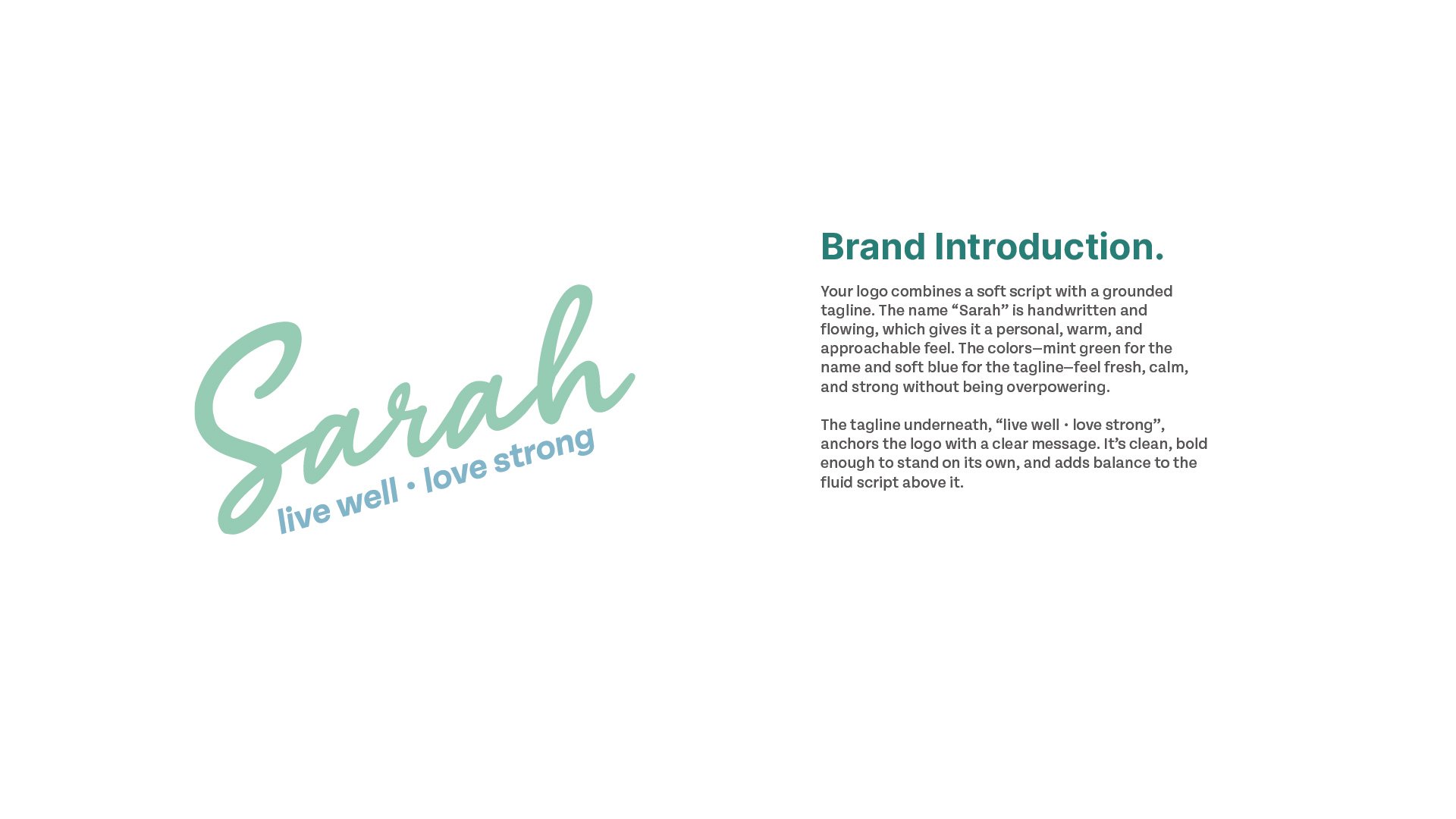
From the very beginning, Sarah had already laid the foundation: she was showing up with heart, coaching women through life’s transitions, and creating a powerful space for single mothers to live well and lead strong. When we partnered to bring her brand to life, she shared her inspiration—something calm, coastal, and grounded in wellness.
We explored two concepts:
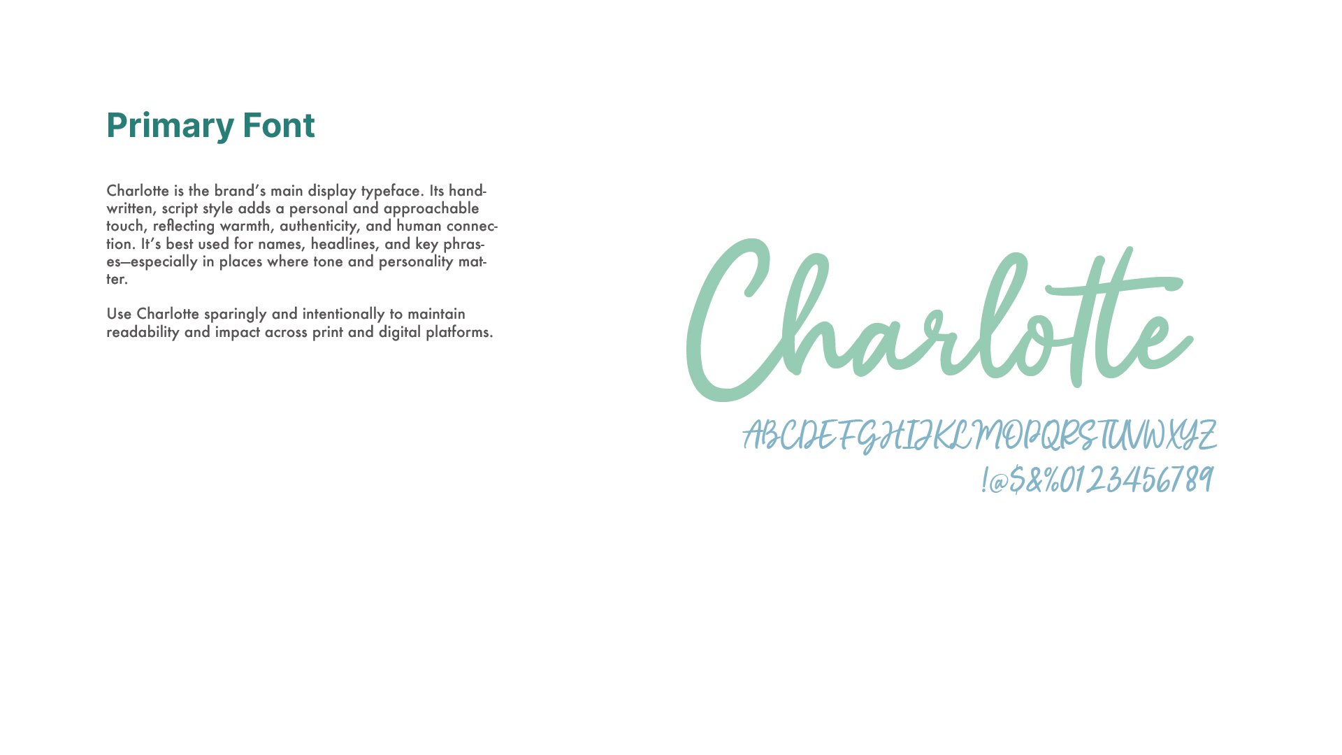
Concept 1 introduced a handwritten logo—soft, personal, and approachable.
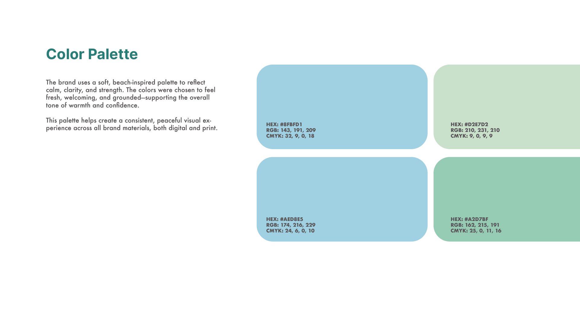
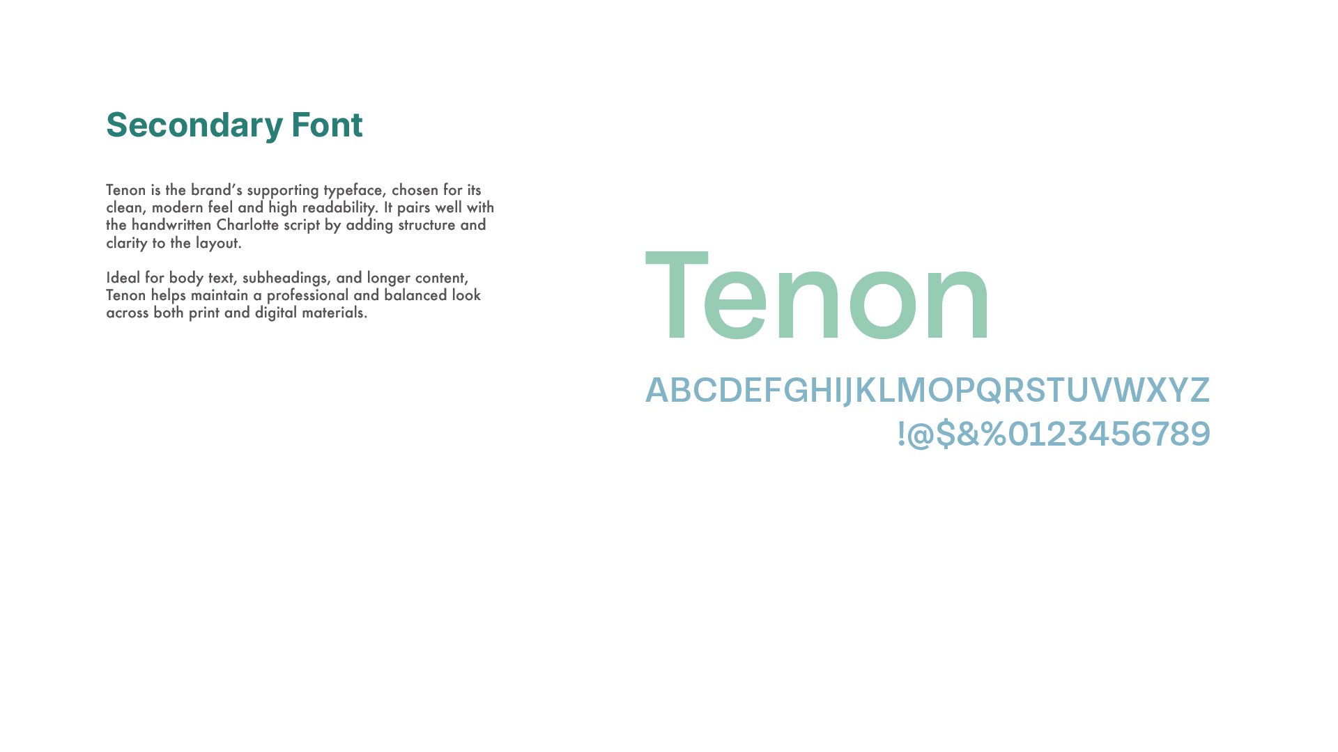
Concept 2 leaned into minimalism with a clean design and serene color palette drawn from the beach.
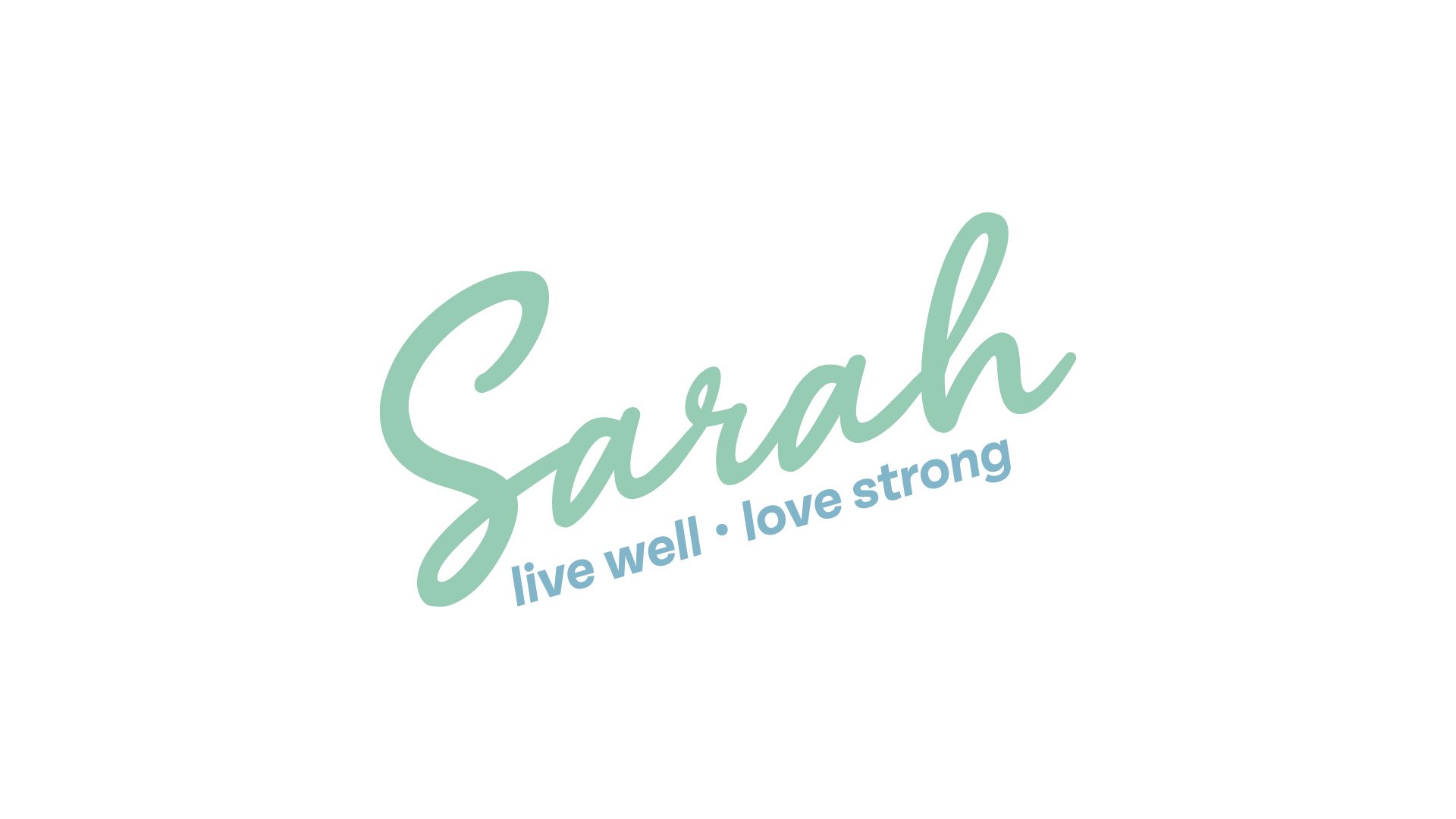
In the end, the final look became a blend of both, but with one special addition that made all the difference: Sarah shared a new tagline—“live well • love strong”—inspired by her own voice and vision. It was a perfect fit, capturing not only the wellness and strength at the heart of her mission but also the love that fuels everything she does.
The finished brand combines:
✅ The handwritten logo from Concept 1 for warmth and authenticity
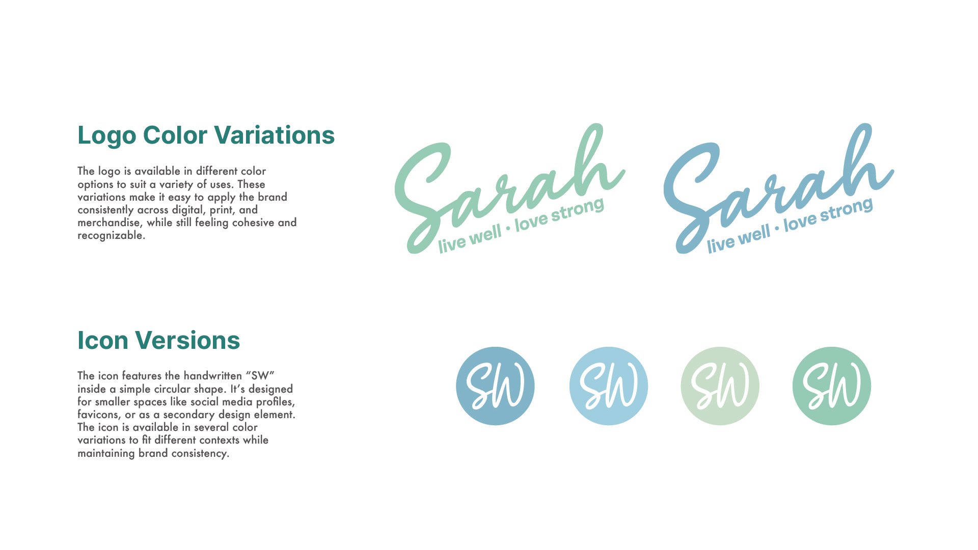
✅ The coastal-inspired color palette from Concept 2 for calm and confidence
✅ The new tagline—“live well • love strong”—directly from Sarah herself
The result is a brand that feels true, polished, and deeply personal—just like Sarah and the important work she leads.
We’re honored to have helped shape this vision and can’t wait to see where it goes next.